Conversion At Carnival Cruises
March 2nd, 2010Well, their advertising got me in the door. I decided to check out what this whole cruise thing was all about. It looks like a great time, but I can’t help but think that their User Experience could be significantly improved (and therefore their conversion rate). Carnival is making some HUGE mistakes.
Making sure you have a usable website, one that is intuitive and easy to navigate, is a key element of converting your visitor into a sale. Lets take the first page after I entered in some information about where and when I wanted to take a cruise:
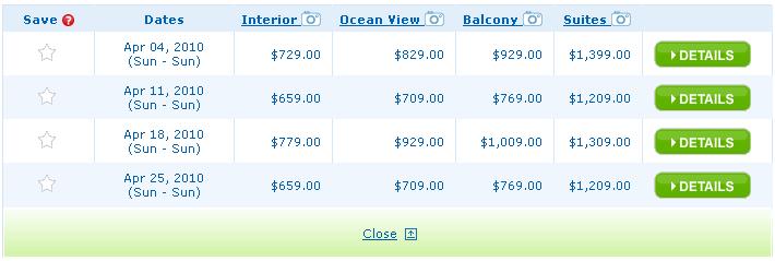
 The first thing I notice is that I am left to assume that these are per person rates. Maybe it says that somewhere on the rest of the page, but this section is clearly the focus.  Making sure your user knows that this is a per person rate will save on hard feelings down then line. After all, I am booking a room and rooms (at hotels) usually don’t care if you have 1 person or 2. If I have never been on a cruise (and I have not) I could easily assume these are rates per room. Update: It does not say that on the page, only when you hover over the lowest price (not shown in picture); does not show up when hovering over any of the other prices.
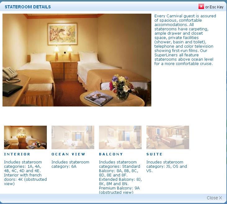
Next I see that the base room would cost me $729 while the Suites will cost $1,399. That’s quite a difference. I wonder what I get for $1,399. Let me click on the “Suites” link with the camera icon. This is what will sell me on getting the expensive room. A nice overlay pops up on top of the current page looking like this:
Hmm…the first thing I notice is that I clicked on the Suite and the picture that pops up looks pretty unremarkable for the price. Oh wait, the Interior room is selected. Huh? That seems like a pretty big miss. But okay, I figure that out and click the suite. I give them another chance to sell me on the room. And…it is just an enlarged picture of the little thumbnail. Thus far I am not convinced that I will double the price of my cruise. But what could they do differently?
First, they could give me more pictures. It is basically free for them and would do tons to help convert me. Some pictures that I would love to see:
- What does the view out the balcony look like?
- How big is the balcony? What does it look like?
- Is there a TV (like in the other rooms)? Where is it?
- How big are the closets? Where are they located?
- What does the bathroom look like?
- It says it has a large vanity/dressing table…where’s that?
- A whirlpool tub is listed. Again, what does it look like?
- How big is the desk in the corner of the room?
All of these things are items that people want to know. They want to know what they are getting for their dollar. Instead there is one generic shot that does almost no good.
The next things is the text below the single picture: “Includes stateroom category: JS, OS and VS.” Ohh, right. Category JS. I’m not sure what JS means to them but to me it means Jack Squat. Why would these letters have any meaning to me? And, to make matters worse, I cannot click them to figure out what the heck they are talking about. It is just meaningless text unless I’m some sort of cruise expert in which case I wouldn’t be on this page to begin with!
Sorry Carnival, I’m not even all that interested in what your big green details button would give me.
What do you guys think?
This has been a Thought From The Cake Scraps.
