RSS 2.0
  • Home
  • About
  • MBA Guide
  • Print Ad Blog
  •  

    The Problem With Reading Site Tools

    May 6th, 2010

    Businesses want to see the product that they have.  That is fairly obvious.  What may be slightly less obvious, though we probably all know it if we stop and think, is that businesses want to provide us with the tools we need to engage with them.  A basic offline example is carts at the grocery store.  This is provided to you simply to make shopping with that store easier and so that you can buy more stuff (as opposed to if you had to carry it all in your hands).

    These same sorts of tools exist on almost all e-commerce websites in one form or another.  A simple example is a search box.  The option to search provides the visitor with a tool to find what they are looking for.  Another example is product categories.  A company doesn’t just put all of the products they have and place them into a single index page.  They try to group them by how they think their (potential) customers would group them.

    All of these things make it easier to engage with the business.  The tools make it easier to shop or discover product.  This, hopefully, will get you to buy more product which is how the business can justify the investment in whatever tool they have developed.  Some, like the search box, are easy to see the value in while others may just be for fun.  Either way the end goal is the same.

    Clearly it costs money to develop and implement these tools, therefore the initiative has to generate money.  This could be directly (sale now) or indirectly (brand goodwill for later purchase and/or consideration).  The hard part is measuring the value of one of these tools retrospectively.  If it was upfront, then test, test test.  But, in some cases, that just isn’t possible or wasn’t done for some other reason and yet the leadership will still want some number to hang their hat on even if it is just a very rough estimate.

    The problem with reading tools after the fact is that it is very hard to prove direct value.  Sure you can see how much demand came through the tool.  Or how many visits interacted with it and how many times it was used in total.  You can look at participation metrics for the tool.  You can look at data point after data point but one very tough question will remain: how much of this is incremental?.  Even if you launch something and it is used by a significant portion of your visits, you will still have a hard time saying what is truly incremental.

    For instance, mother’s day is coming up.  Let’s say you launch a page that lists many products for mom.  You may see that for those visits the % of time that a product is viewed and then purchased will decline.  But don’t worry, they are just browsing for gifts.  They are using the tool exactly as expected.  But if this change in behavior happened on the whole site you would have an issue because people are viewing product and simply not buying.  You might read that as a poorly designed product page or that your visitor can’t find the information they want.

    On the flip side, you may launch some tool and find that anybody that touches the tool is like pure gold.  Conversion is up 50% for visits that use the tool.  Everything looks great, right?  Well, what if all of those people were your best customers anyway; what if they are your most engaged and most likely to buy?  Perhaps your tool is actually lowering conversion for these people, but the fact that they perform so well compared to the site as a whole causes you to miss this issue.  And, at worst, to declare the new tool a success!

    The solution, of course, is to test everything.  That way you will have a true and clean read of the exact lift of a new tool.

    What are your favorite tools that you wish all sites had?

    This has been a Thought From The Cake Scraps.


    Use Events To Track Progress

    April 30th, 2010

    Conversion, however that is defined for a site, is always the reason the site exists.  For me, a conversion is a visitor viewing at least 2 pages.  If I can do that then I know that I have engaged the person enough to look around the site a bit more.  You probably have some other definition of a successful conversion on your site.

    A fairly common conversion point for a website is account creation or e-mail capture (e-mail sign-up).  The most common way to look at how successful the sign-up process is is by using a fallout report.  A nice funnel that shows how many you started with and how many fell out at each step.  The bottom of the funnel is the total number of people that made it through the process.  This is a great way to look at things but there are two very different ways of doing it.

    The first way is based on pages viewed.  This is a very common way to look at fallout.  People that made it from Page A to Page B to Page C.  This works nicely in a very straightforward way.  It gives you a nice view of the total performance of that site path.  Unfortunately, at least in some WA tools, that is about all you can get at with the basic reporting capabilities.  The problem with this is that you might be missing some huge cake scraps, or golden nuggets, of information by looking at the data in aggregate.

    Setting a success event on each of these pages will provide a much greater degree of flexibility.  For instance you could very easily look at campaign tracking codes and see how many of each event was set for each tracking code.  This might give you information that you simply didn’t have before.

    Say, for example, that you had both display advertising and paid search campaigns pushing traffic to your site.  In all likelihood you know what the conversion is off of each of these tracking codes but you might not know how many of your email sign-ups are coming from each campaign.   It is very easy to start setting a success event on the sign-up confirmed page so that now you can get a count of that event by campaign tracking code.  Perhaps you find out that your paid search converts better but they don’t come and sign up for email.  This might cause you to change the messaging that you are doing in paid search (perhaps message email strong to drive sign-ups or message something else since e-mail sign-up just didn’t work).

    Similarly, if you had a 2-step process, and set a success event on each page, you would be able to see if one type of campaign had huge sign-up issues.  Perhaps you would learn that you want to create a different on-site expirence for that type of campaign to drive up sign-ups.

    Another thing that is great about using events is that they are easy to trend across time whereas fallout reports based on page views can be a bit more difficult or time consuming to generate.  The downside is that you probably have a limited number of events, so use them wisely.

    What type of conversion goal do you have for your website?

    This has been a Thought From The Cake Scraps.

    Conversion At Carnival Cruises

    March 2nd, 2010

    Well, their advertising got me in the door.  I decided to check out what this whole cruise thing was all about.  It looks like a great time, but I can’t help but think that their User Experience could be significantly improved (and therefore their conversion rate). Carnival is making some HUGE mistakes.

    Making sure you have a usable website, one that is intuitive and easy to navigate, is a key element of converting your visitor into a sale.  Lets take the first page after I entered in some information about where and when I wanted to take a cruise:

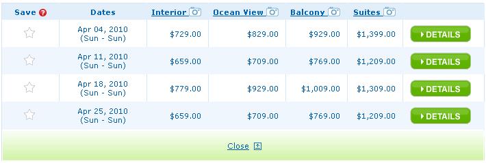
    The first thing I notice is that I am left to assume that these are per person rates.  Maybe it says that somewhere on the rest of the page, but this section is clearly the focus.   Making sure your user knows that this is a per person rate will save on hard feelings down then line.  After all, I am booking a room and rooms (at hotels) usually don’t care if you have 1 person or 2.  If I have never been on a cruise (and I have not) I could easily assume these are rates per room.  Update: It does not say that on the page, only when you hover over the lowest price (not shown in picture); does not show up when hovering over any of the other prices.

    Next I see that the base room would cost me $729 while the Suites will cost $1,399.  That’s quite a difference.  I wonder what I get for $1,399.  Let me click on the “Suites” link with the camera icon.  This is what will sell me on getting the expensive room.  A nice overlay pops up on top of the current page looking like this:

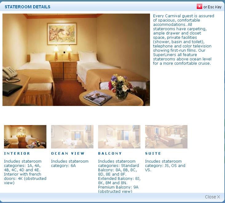
    Hmm…the first thing I notice is that I clicked on the Suite and the picture that pops up looks pretty unremarkable for the price.  Oh wait, the Interior room is selected.  Huh?  That seems like a pretty big miss.  But okay, I figure that out and click the suite.  I give them another chance to sell me on the room.  And…it is just an enlarged picture of the little thumbnail.  Thus far I am not convinced that I will double the price of my cruise.  But what could they do differently?

    First, they could give me more pictures.  It is basically free for them and would do tons to help convert me.  Some pictures that I would love to see:

    • What does the view out the balcony look like?
    • How big is the balcony?  What does it look like?
    • Is there a TV (like in the other rooms)?  Where is it?
    • How big are the closets?  Where are they located?
    • What does the bathroom look like?
    • It says it has a large vanity/dressing table…where’s that?
    • A whirlpool tub is listed.  Again, what does it look like?
    • How big is the desk in the corner of the room?

    All of these things are items that people want to know.  They want to know what they are getting for their dollar.  Instead there is one generic shot that does almost no good.

    The next things is the text below the single picture: “Includes stateroom category: JS, OS and VS.”  Ohh, right.  Category JS.  I’m not sure what JS means to them but to me it means Jack Squat.  Why would these letters have any meaning to me?  And, to make matters worse, I cannot click them to figure out what the heck they are talking about.  It is just meaningless text unless I’m some sort of cruise expert in which case I wouldn’t be on this page to begin with!

    Sorry Carnival, I’m not even all that interested in what your big green details button would give me.

    What do you guys think?

    This has been a Thought From The Cake Scraps.


    Estimating Demand Impact And Conversion Rates

    December 30th, 2008

    I was recently working on an interesting project where I was estimating the demand impact of a change that we had implemented to our site.  Without getting into the details, a change was made so that the customer would be less distracted during their shopping experience.  This then – hopefully – keeps the visitor more engaged with the site and if everything else goes well, they will then buy.

    The tricky part is that the likelihood to convert changes at different points on the site, though it is a bit difficult to get it.

    For example, if all a visitor sees is the homepage, they are going to convert at some percent.  Assume 10% for easy math.  If a visitor doesn’t bounce – meaning come to the site, see one page, and leave – say the percent to convert increases to 20%.  If the visitor then sees a product page they are now going to convert 30% of the time.  And finally if they enter the checkout process they will convert 40% of the time.  The point is that the level that the customer is at in the site changes the likelihood of conversion.

    This seems like it would be a very obvious thing, and to a certain extent it is.  The key component here is not that these differences exist and you know about them.  The key is taking that knowledge into account when making an estimate for demand impact of a change.

    If visitors have all of these different conversion points and a change is made that causes 1,000 visitors to not leave the site you need to take these conversion points into account.  Saying that the 100 more people will buy (using 1,000 visitors * 10 % conversion from homepage) is just as misleading as saying that 400 people will buy (using 1,000 visitors * 40% conversion rate from checkout pages).  When making a demand impact, make sure that you include a few inputs for these different areas.

    For example: 100 visitors * 10% + 300 * 20% + etc.  As long as the percents add up to 100% and the visitors add up to your total you are in good shape.  You can then take this number times your average order value and you now have a demand estimate.  Note that you could even take this a step more and apply a different average order value to people who have been in different areas of the site.  For instance someone who is shopping for Outerwear or A laptop will probably have a different average order value then an individual looking at flip-flops or computer cables.

    Ultimately you can segment this to any level that you are able to get.  Just make sure that the work that you put into arriving at the final number is worth it – especially if you are using the Omniture Excel Client.  Make a judgement call.  If it is just going to be small dollars or you really just need a ballpark then take the 1,000 visitors * 25% or something like that.  It is a guess, but it should be an educated guess.  Each different analysis will require varying levles of confidence.

    Have you done anything like this before?  How did it go?

    This has been a Thought From The Cake Scraps.